
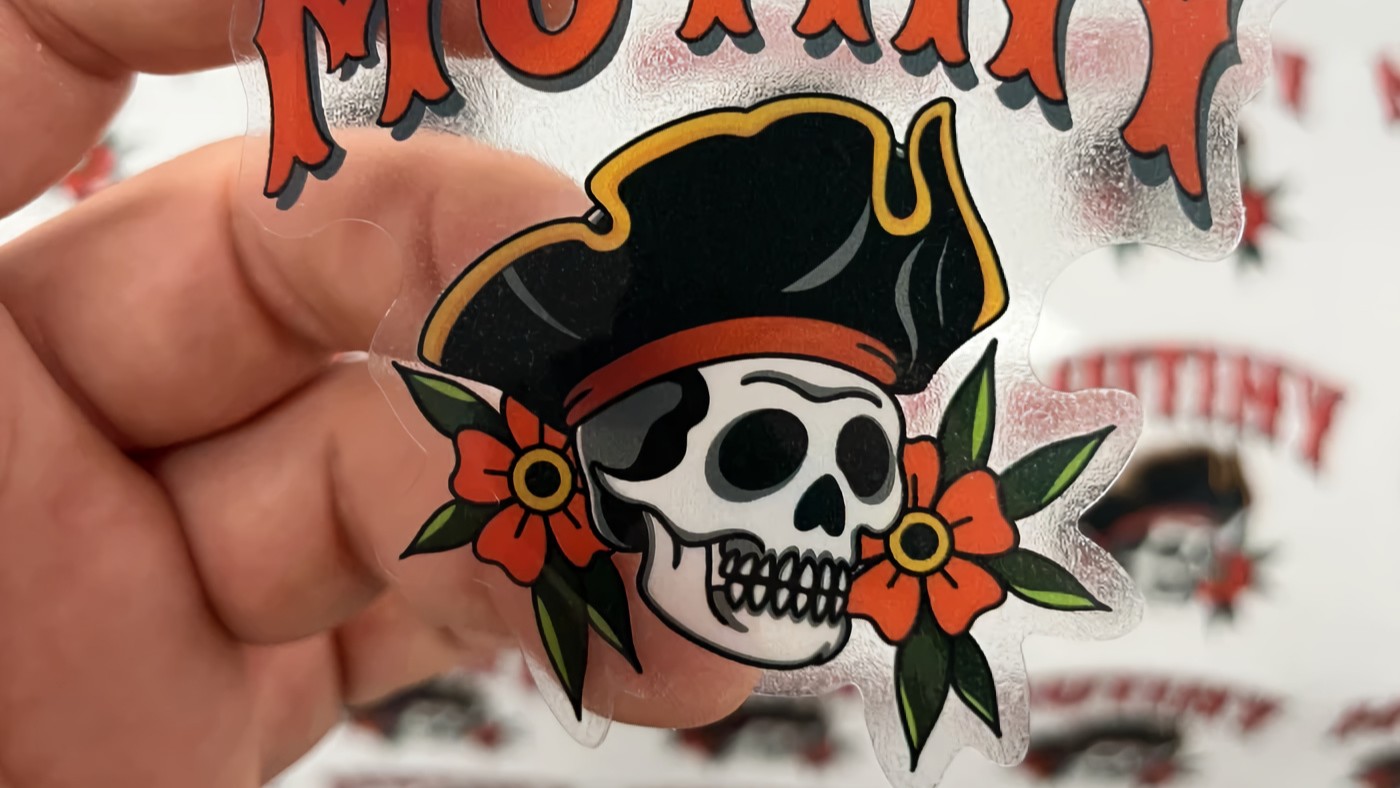
White ink printing is one of those production details that brands tend to ignore right up until the first sample shows up and looks… off. The logo feels faded. The soft beige turns muddy. The “white” text is not white at all because on clear material, there is no white unless somebody actually prints it. That is the part a lot of teams miss. On screen, white feels automatic. In print, especially on clear, metallic, kraft, or dark stock, it is a real decision.
And that decision affects a lot more than people think.
I have seen brands spend hours debating bottle shape, cap color, or whether the label should be matte or gloss, then treat white ink printing like some tiny technical footnote. But for clear packaging and specialty materials, it can be the difference between a label that looks clean and intentional and one that looks washed out, hard to read, or just plain unfinished.
Why White Ink Printing Gets Overlooked
Part of the problem is that most mockups lie a little.
A digital proof on a white artboard makes everything look stable. Your cream background looks creamy. Your pale pink type looks soft and elegant. Your white logo looks crisp. Then you put that same design onto a clear label on top of amber glass, silver metal, or a black pouch, and suddenly the package underneath starts changing the color story.
That is not a print defect. That is physics being annoying.
White ink printing gets overlooked because most people think in CMYK and forget that substrate color matters. But the material under the ink is part of the final image. If you print on a white paper label, the stock itself is doing some of the work for you. If you print on clear film, the package shows through. If you print on metallic stock, the shine changes the color. If you print on kraft, the brown base warms everything up. If you print on dark material, some colors lose strength fast.
So yes, white ink matters. Often more than the design tweaks people obsess over.
What White Ink Actually Does
At the simplest level, white ink printing adds opacity where the base material would otherwise show through.
That can happen in a few ways:
- A white underbase can sit beneath all or part of the design so colors stay solid.
- Spot white can be used only in selected areas, like behind text, logos, or icons.
- White can also be skipped in certain areas on purpose, letting the clear, metallic, or kraft material show through as part of the design.
That last part is where things get interesting. White ink is not only about making everything opaque. It is also about controlling what stays transparent and what does not. Good packaging design on specialty stock is often less about “print the artwork” and more about “decide exactly what the material should do.”
That is why white ink printing is a design tool, not just a production setting.
Why White Ink Printing Matters So Much on Clear Labels
Clear labels are probably the best example because the problem is easy to see.
Without white ink, clear labels let the container behind the print influence the final result. That can work if you want a no-label look and your design is built for it. But if the artwork was designed assuming a solid white background, things can fall apart fast.
A pale yellow logo on a clear bottle might look fine on a bright product mockup and nearly disappear on the actual package. White text can vanish entirely because there is no white toner or ink being laid down in that spot. And brand colors can shift depending on whether the label is applied to clear glass, frosted plastic, a tinted bottle, or something with product showing through behind it.
That is why white ink printing is so important for clear packaging. It gives the printed areas a base so they stay readable and closer to the intended color. It also lets you mix opacity and transparency on purpose instead of by accident.
If you want a deeper look at how clear stock behaves, How to Get the Most Out of Your Clear Labels is a useful read. It covers the practical side of designing for clear material, which is where a lot of these problems start.
Dark, Metallic, and Kraft Materials Have the Same Problem
This is not only a clear-label issue.
Dark materials can swallow color. Metallic materials can shift it. Kraft materials can mute it. In all three cases, white ink printing gives you control back.
On dark substrates, white underprint can keep logos, small type, and accent colors from getting lost. On metallic stock, it can preserve accurate color where you need it while leaving other areas unprinted so the metallic effect still shows. On kraft labels, it can brighten selected elements without removing the natural paper look from the whole design.
This matters for packaging because brands rarely want the entire label treated the same way. You might want the logo to stay brand-accurate, the product name to stay readable, and a background pattern to let the stock show through. That mix only works cleanly if the white layer is planned.
Otherwise, you get one of those labels that looked “premium” in the concept phase and then showed up looking tired in real life.
Brand Consistency Lives in These Small Decisions
A lot of people treat white ink like a visual bonus. I think that undersells it.
It is really a consistency tool.
If your brand shows up on a shelf, in a shipping box, in an influencer mailer, and in customer photos, you need it to look like the same brand every time. That gets harder when the print process changes the appearance of your colors and type based on whatever surface sits underneath the label.
White ink printing helps control that. It reduces surprises. It helps the same artwork behave more predictably across clear film, specialty stock, and different container colors. And when you are ordering in batches over time, that predictability matters a lot.
It also matters for plain practical reasons. Ingredient text. Barcodes. QR codes. Fine lines. Small logos. Legal copy. A lot of those elements are less forgiving than the main front-panel artwork. If the contrast drops too much, it is not just a style issue anymore. It becomes a usability issue.
The Most Common White Ink Mistakes
I keep seeing the same mistakes come up, especially with newer brands and quick-turn packaging jobs.
The first mistake is assuming white in the file will automatically print as white. On standard printing setups, that is often not how it works. White may simply mean “no ink here,” which is a huge difference on clear or non-white stock.
The second mistake is using clear material because it looks cool, but not planning the design around transparency. Clear can look great. It can also make half your artwork disappear.
The third mistake is failing to specify where white should and should not go. If you want selective transparency, that needs to be intentional. If you want full opacity behind text only, that needs to be intentional too.
And the fourth mistake is choosing a print partner that cannot actually produce white ink printing when the job needs it.
That last one is where the conversation gets very real. Plenty of brands think they are comparing sticker companies based on price, turnaround, or finish options, but the real gap is capability. If the printer cannot lay down white ink where the design requires it, the rest of the comparison gets a lot less interesting.
Why This Matters for Labels, Not Just Stickers
People hear “white ink” and sometimes think of decals, clear window graphics, or fancy promo stickers. But this matters just as much for product labels.
Product labels often do two jobs at once. They need to look branded and polished, but they also need to communicate clearly. When they are wrapped around a bottle, jar, pouch, or box, the package itself becomes part of the visual result. That is especially true with clear BOPP, PET, metallic film, and other specialty stocks.
If you are doing food, cosmetics, supplements, candles, drinks, or boutique retail packaging, white ink printing can be the thing that keeps your label from looking homemade. Not because white ink is some magic button, but because it gives you control over opacity, contrast, and color behavior.
And honestly, control is the whole game in print.
Where CustomStickers.com Fits In
This is one reason I think it helps to work with a shop that can actually handle specialty label production instead of treating it like an exception. CustomStickers.com offers white ink printing, which matters for brands using clear and other specialty label materials where opacity and color control matter.
That does not mean every job needs white ink. Some designs look better when parts of the material show through. But when a brand wants selective opacity, stronger color, readable fine text, or a cleaner no-label look, having white ink as an available production option matters a lot.
And it fits into the bigger print-quality conversation too. If you want a broader look at file quality, materials, and what separates a strong finished sticker or label from a mediocre one, What Makes a High Quality Sticker is worth reading.
The Better Question to Ask Before You Print
Most brands ask, “Can this printer make clear labels?”
That is not the best question.
A better one is, “How will this design behave on the actual material, and do we need white ink printing to make it work?”
That question gets you closer to the real result. It forces the design team, brand team, and print partner to think about opacity, contrast, readability, and consistency before money gets spent on the wrong run.
Because once you start printing on anything other than plain white stock, white stops being the default. It becomes a choice.
And if the choice is made well, nobody notices. The label just looks right.
That is usually the sign that the production decisions were doing their job.
